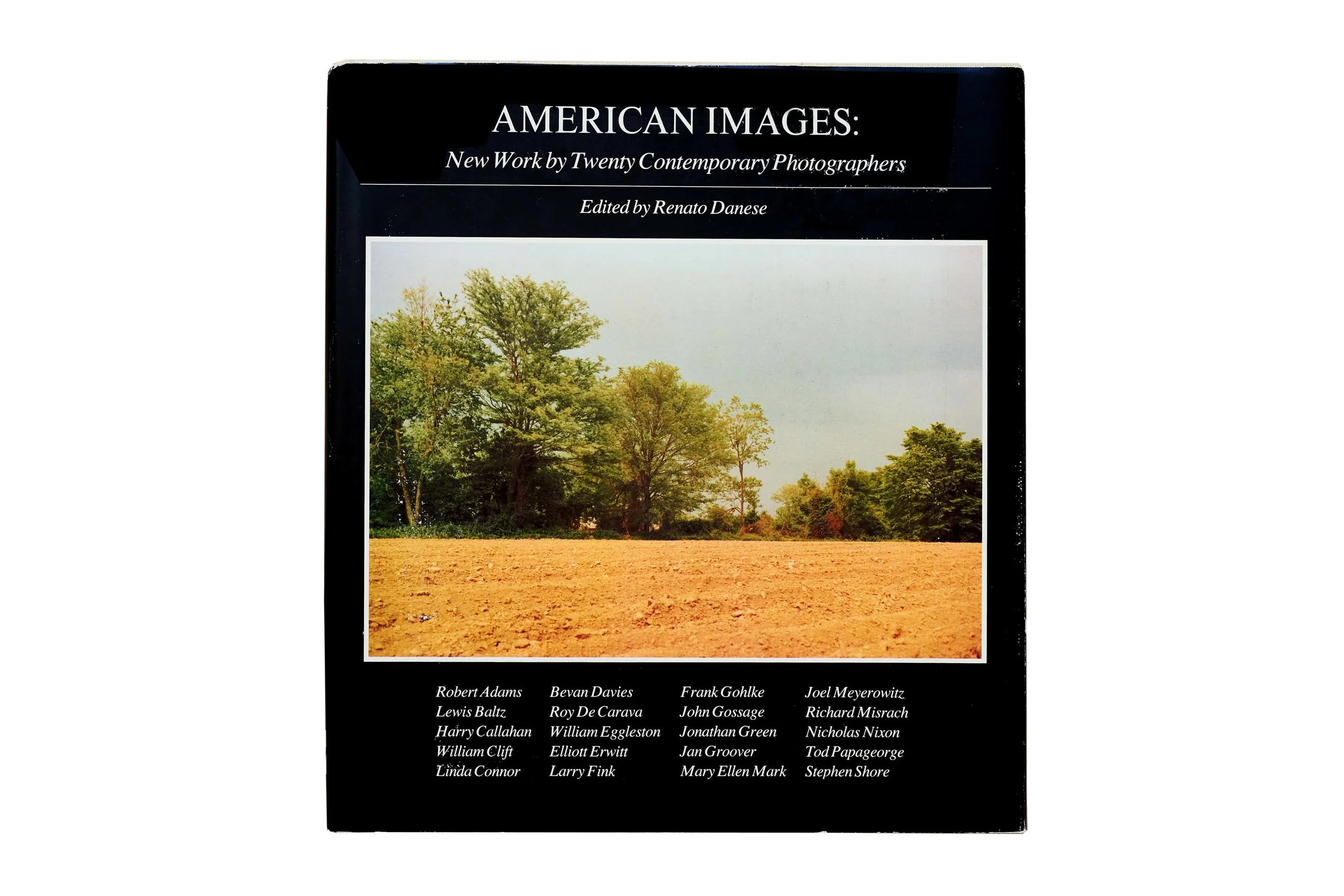
The two books compiling work from various photographers that were extremely important to me as a young photo student in 1987 oddly shared the same title. American Images edited by Pete Turner and American Images edited by Renato Danese. It is this second book I want to highlight here.
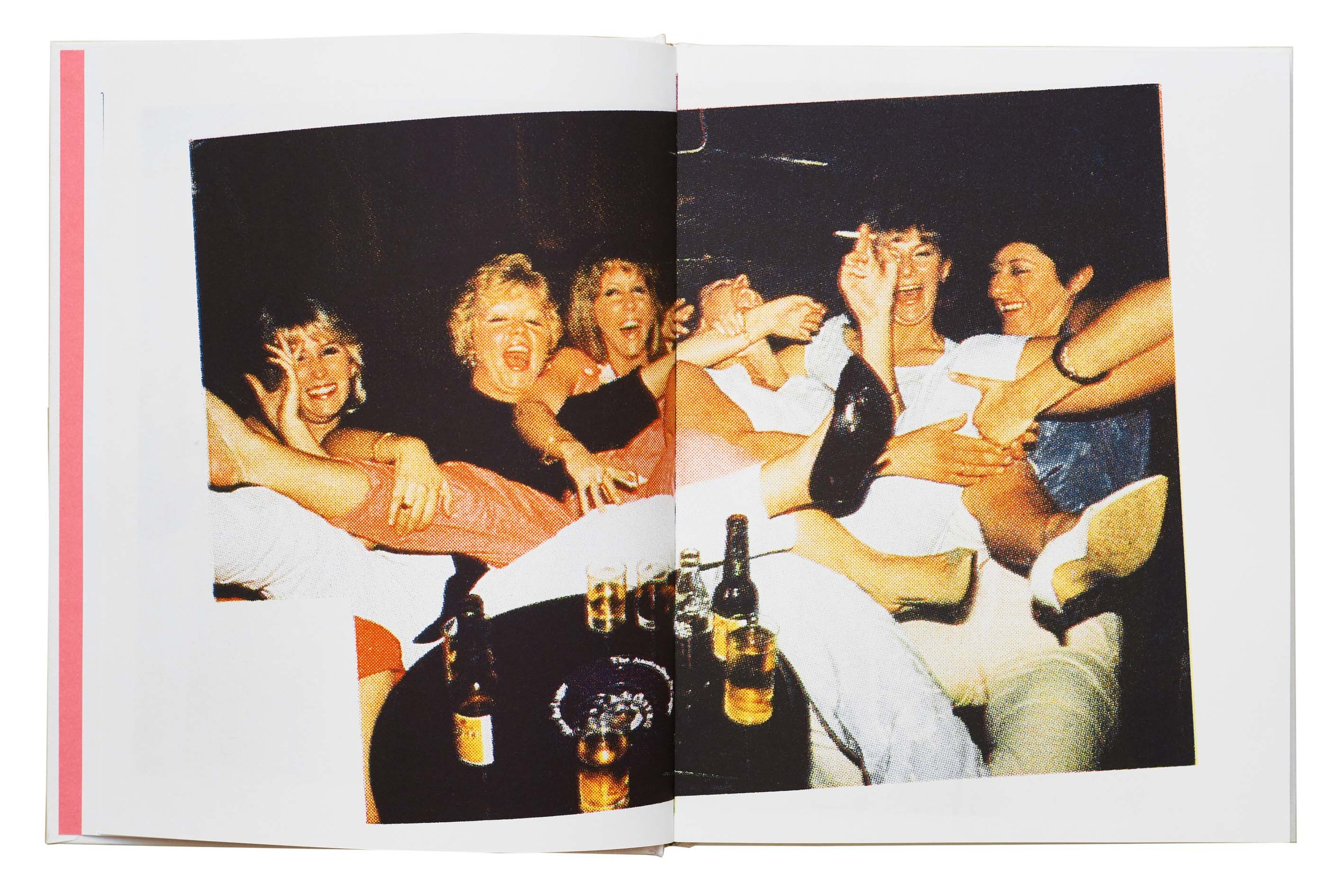
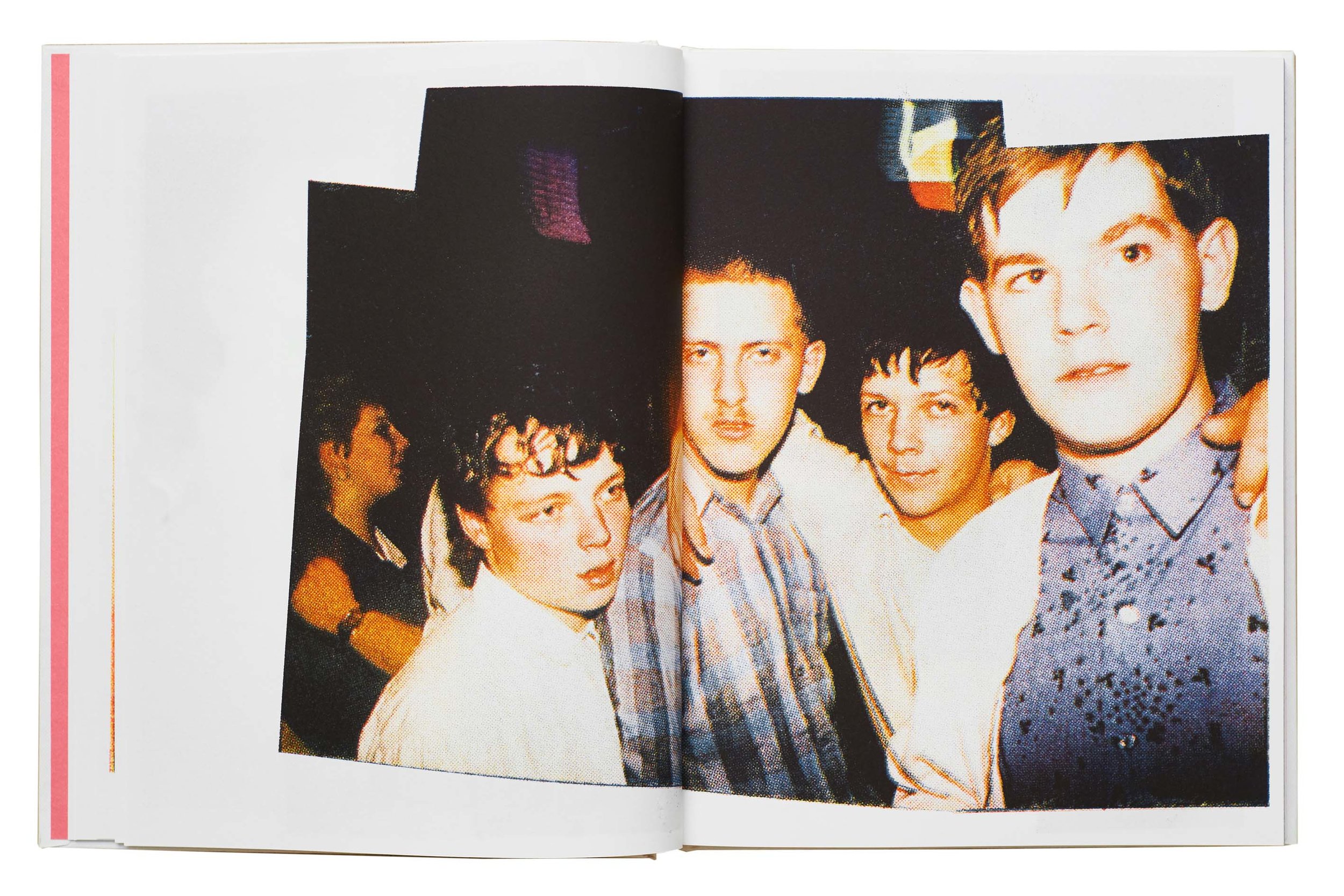
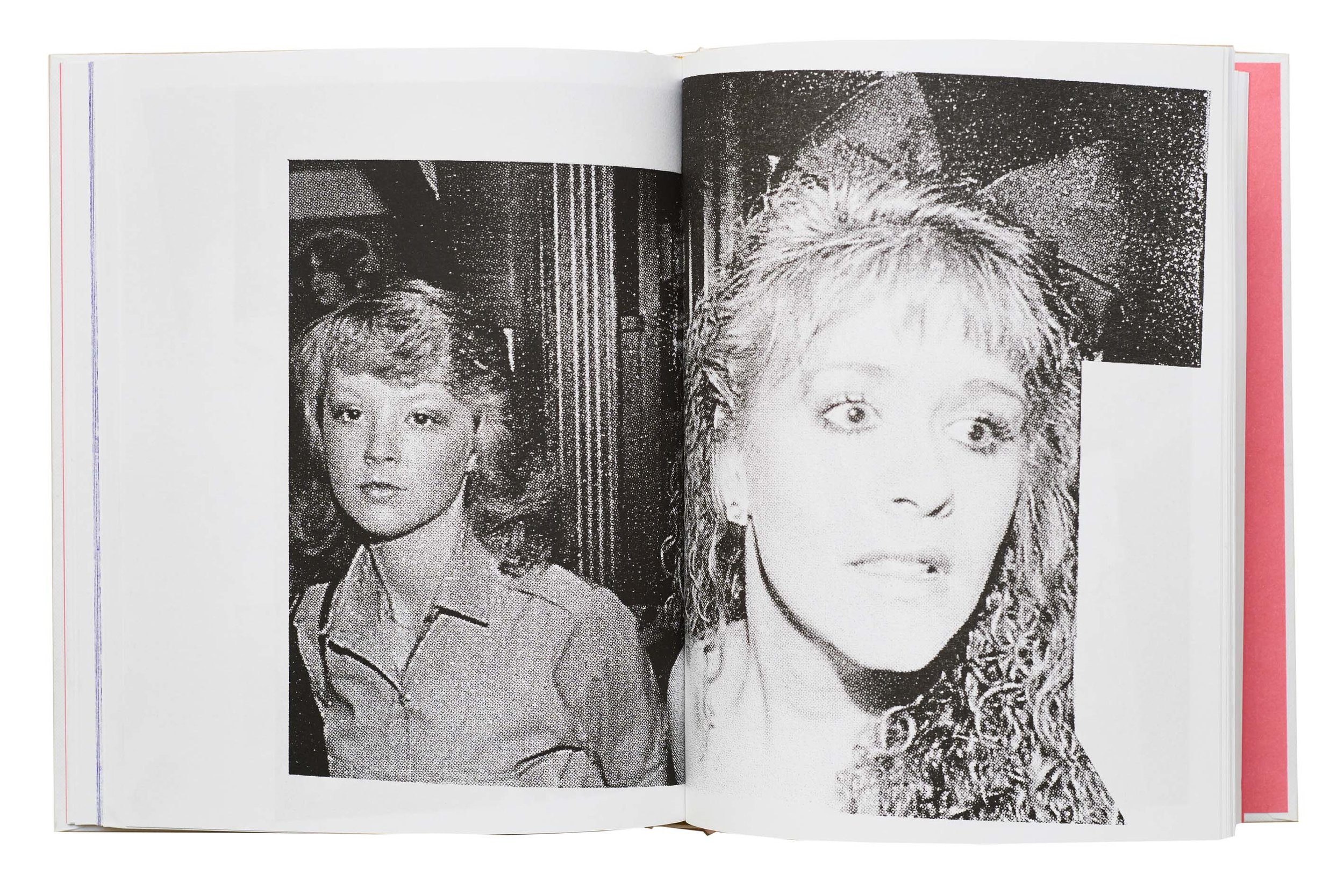
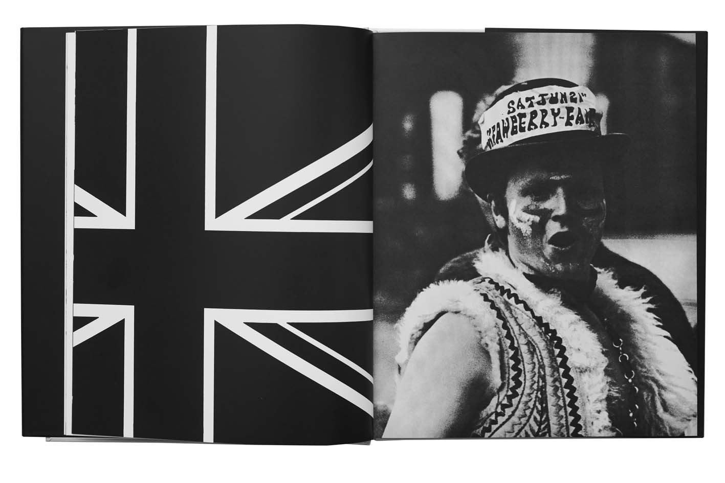
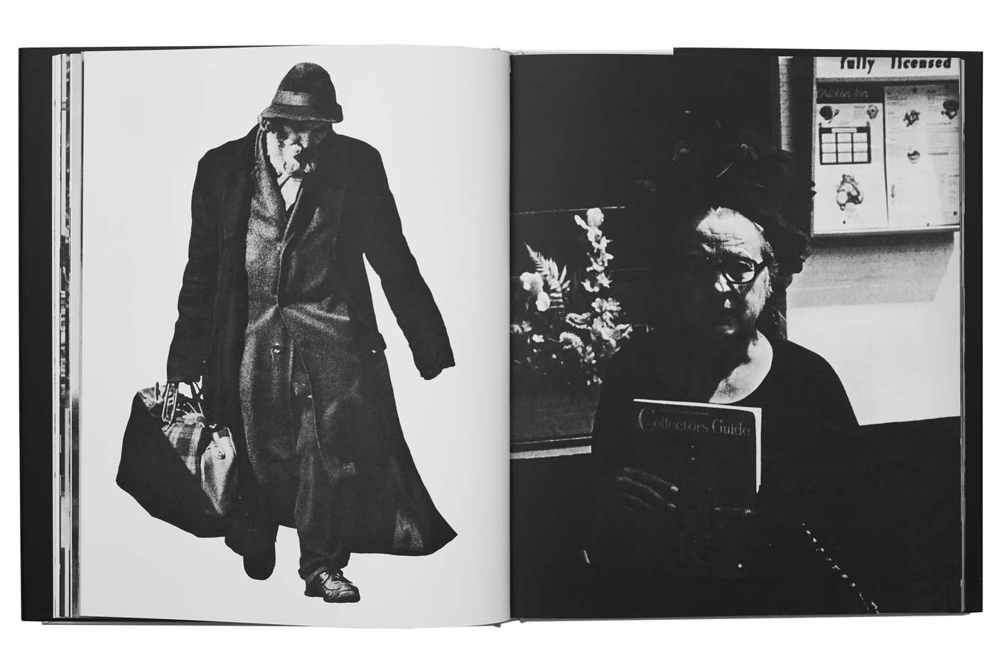
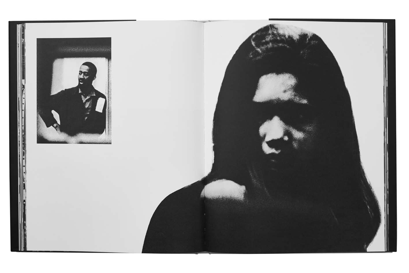
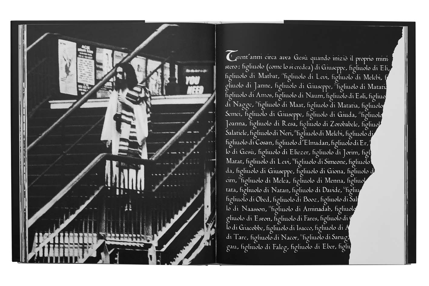
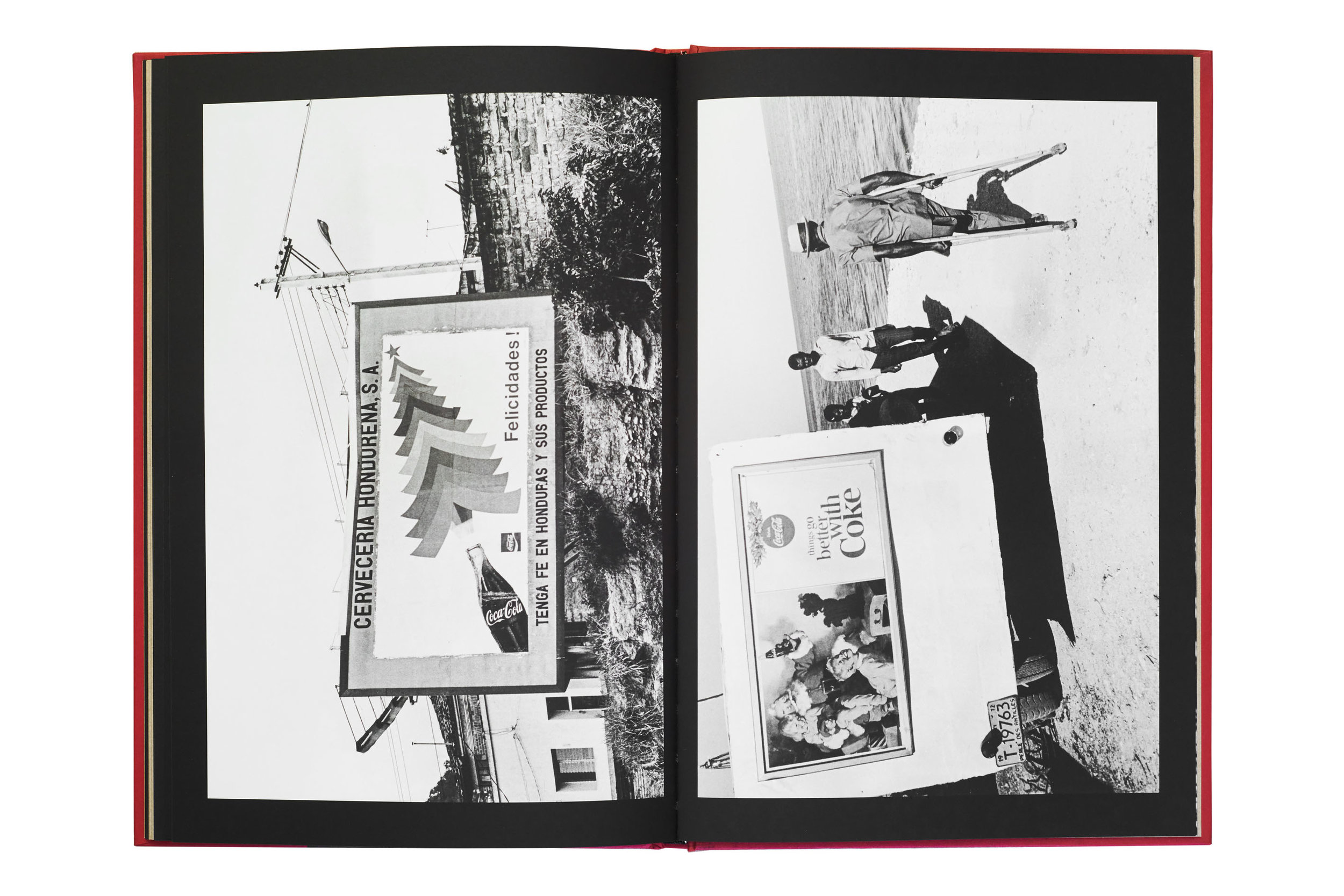
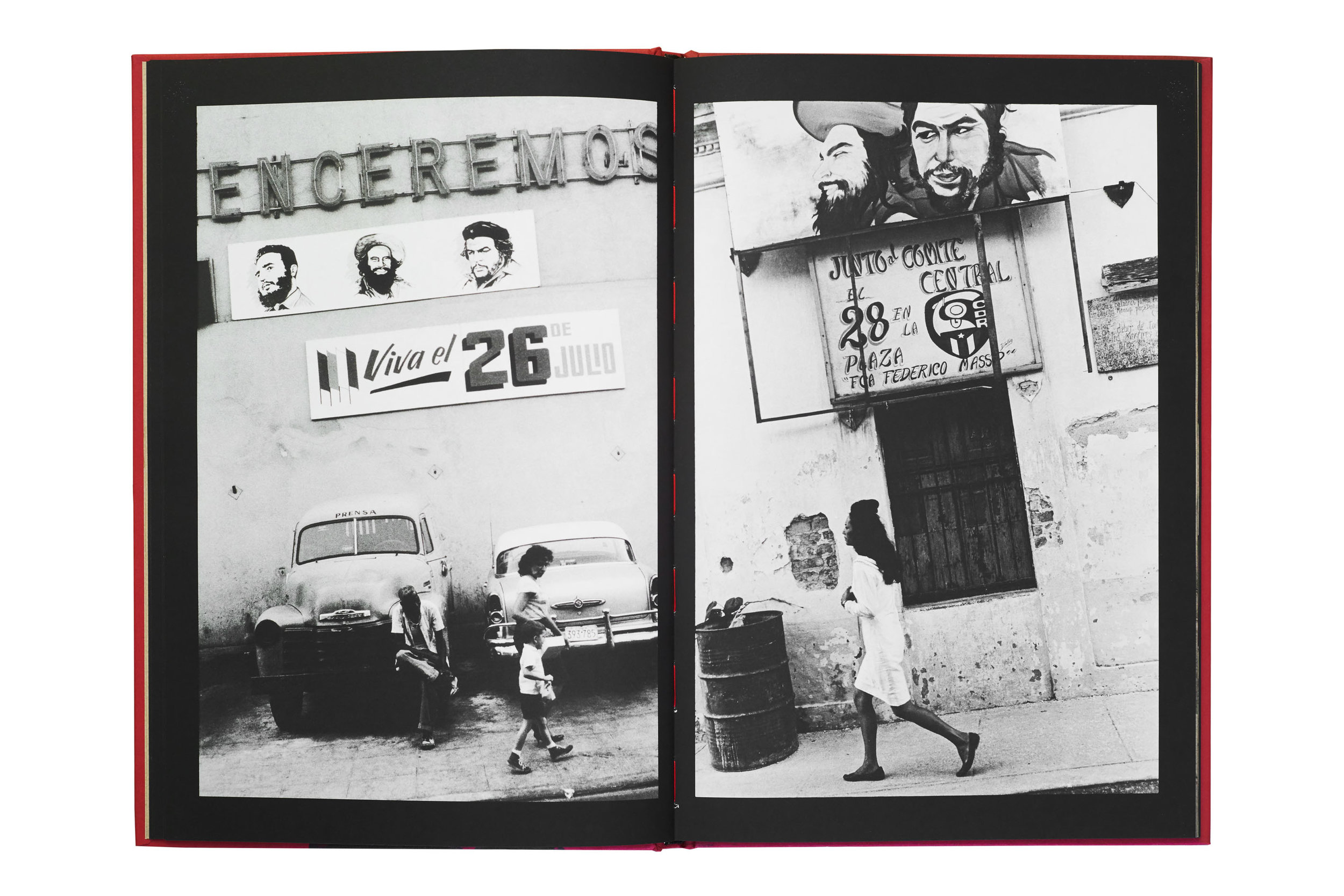
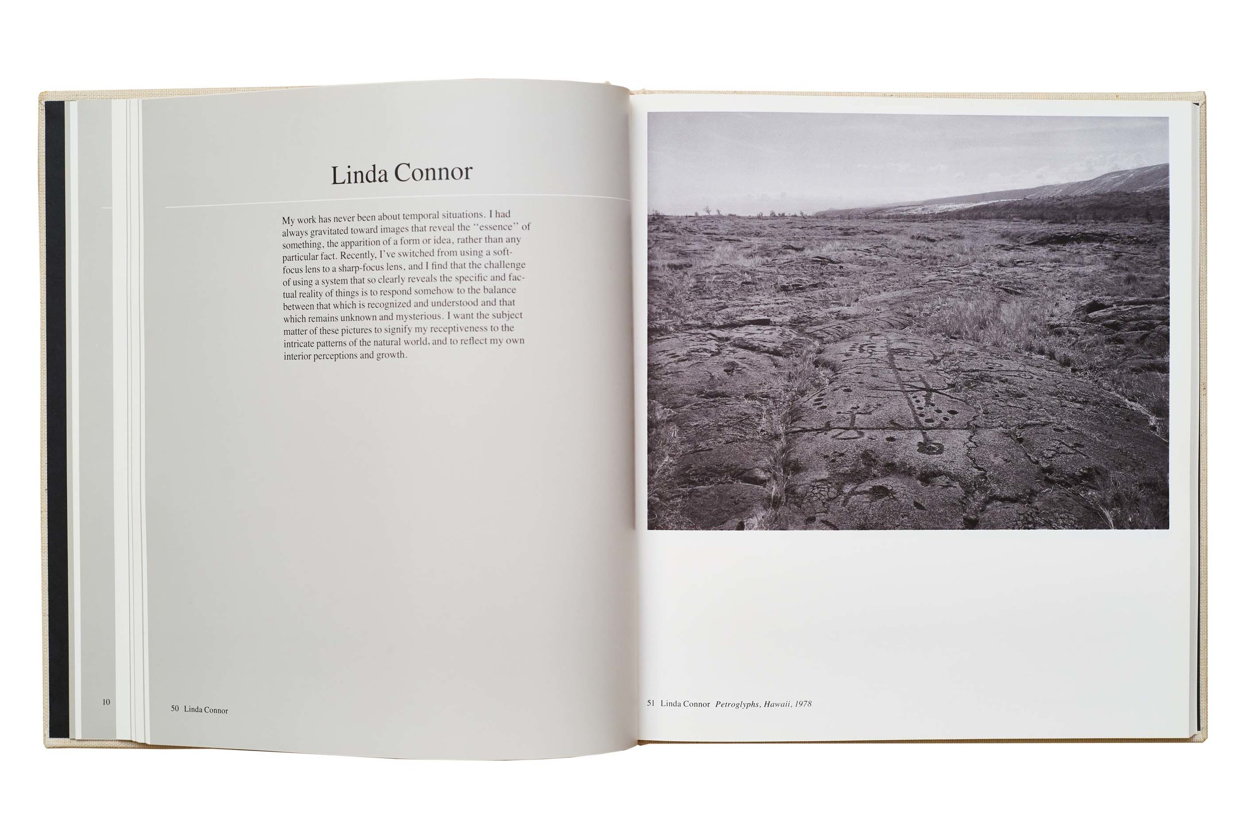
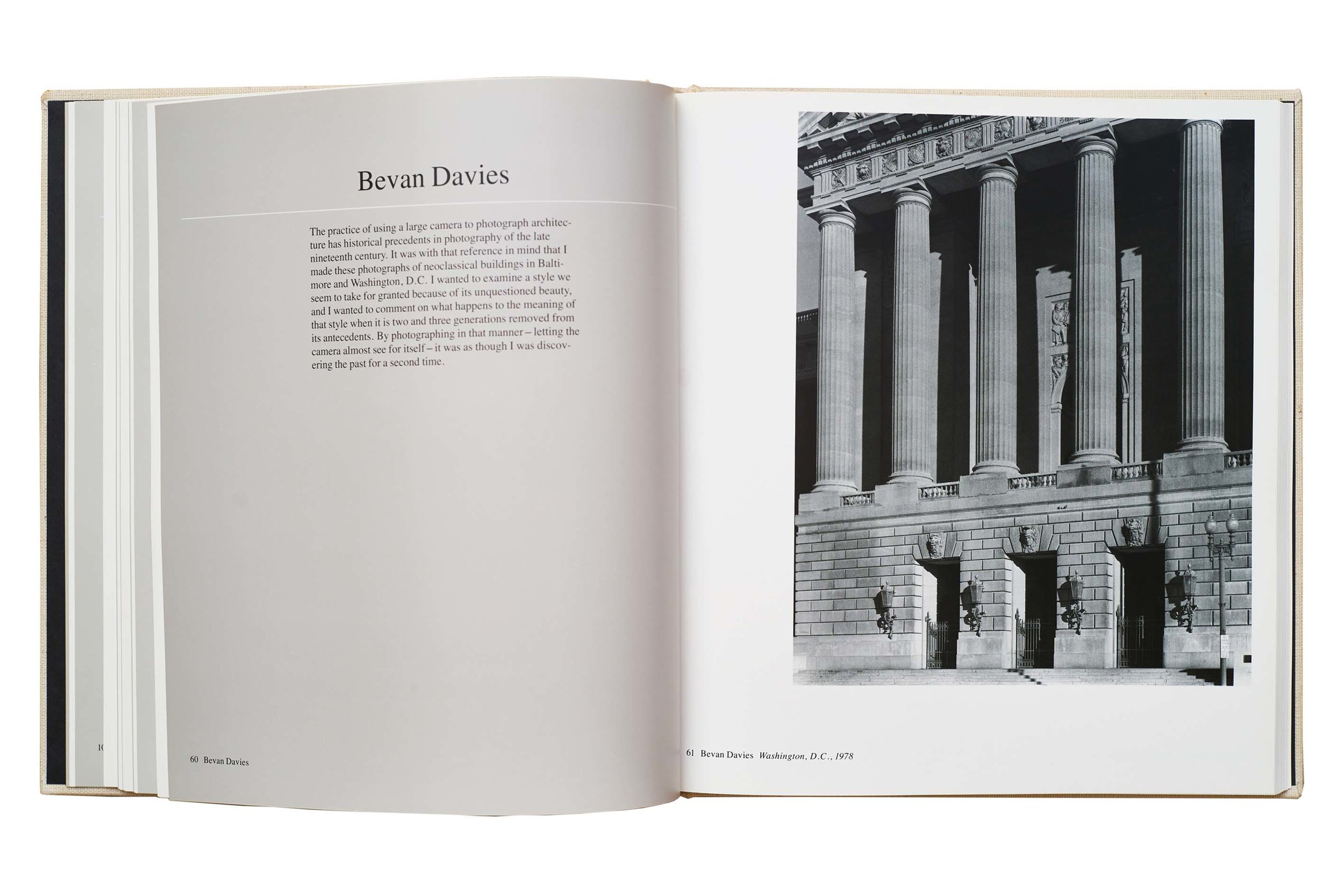
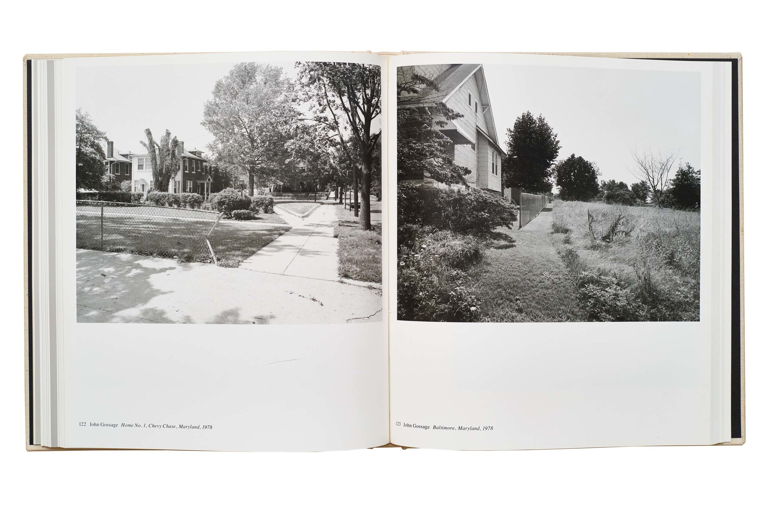
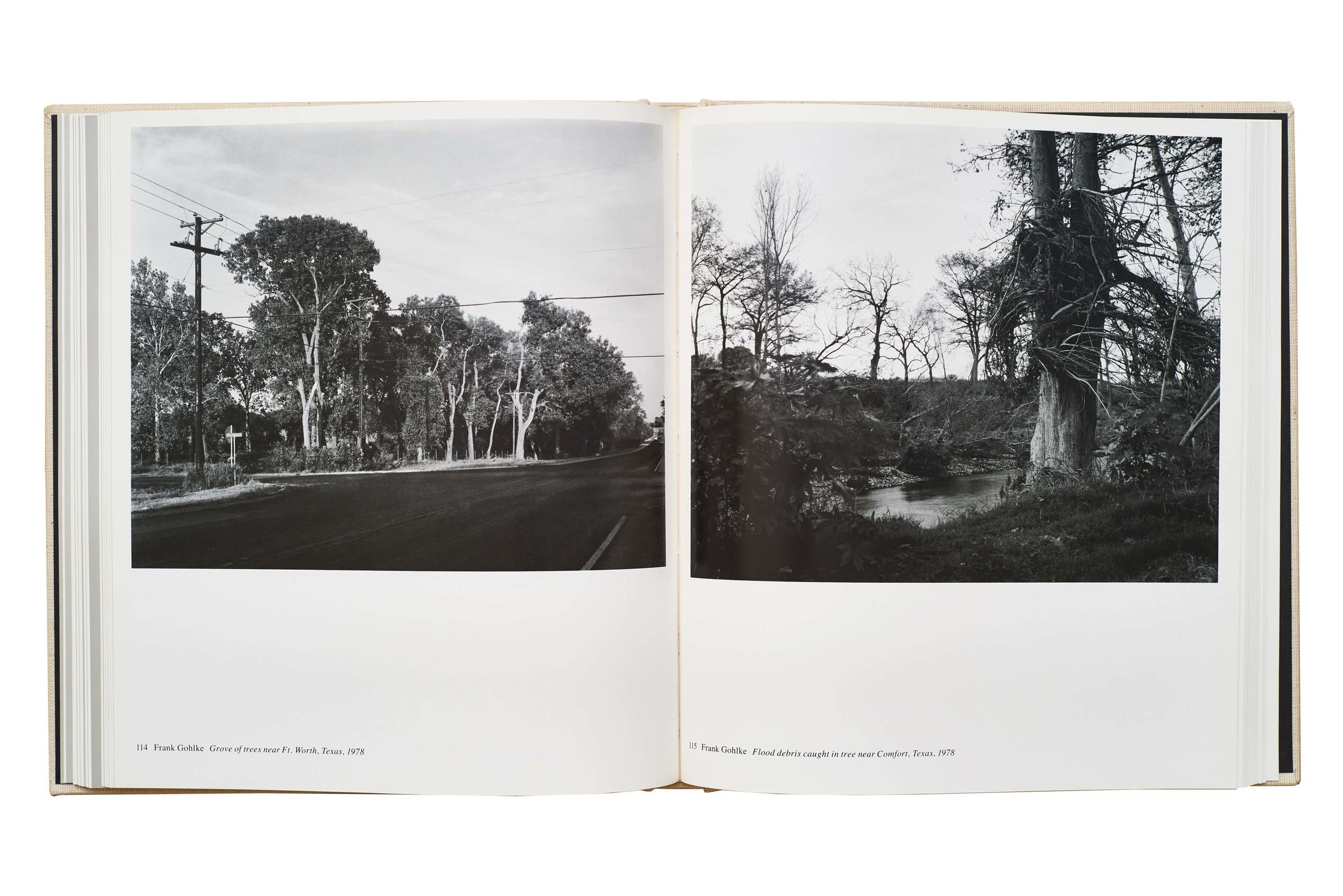
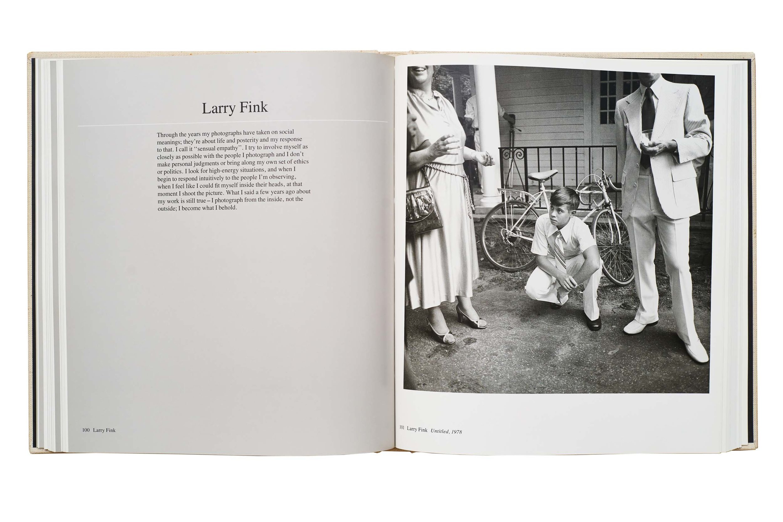
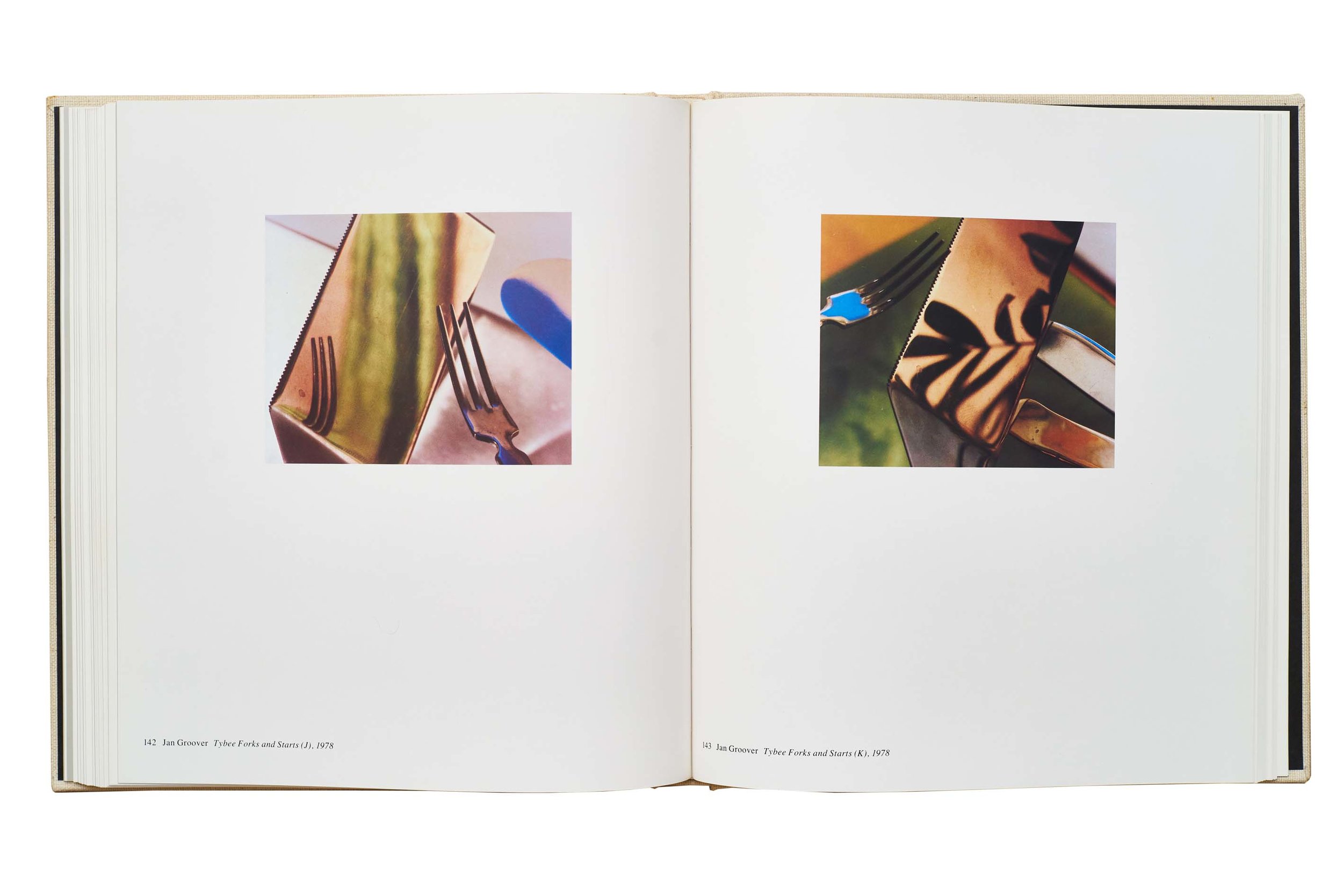
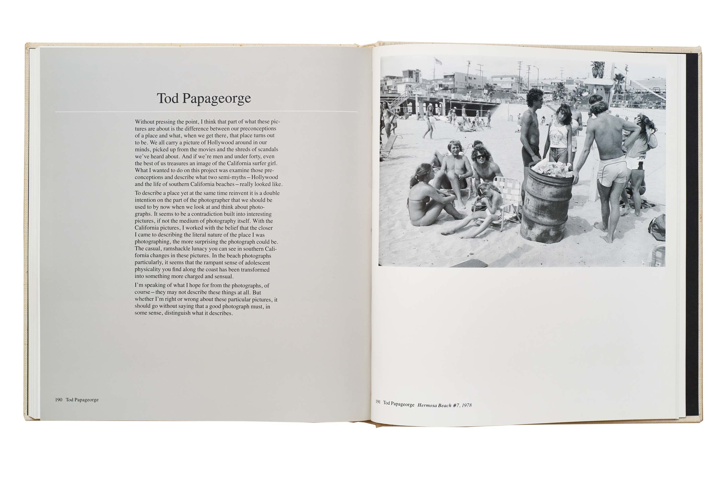
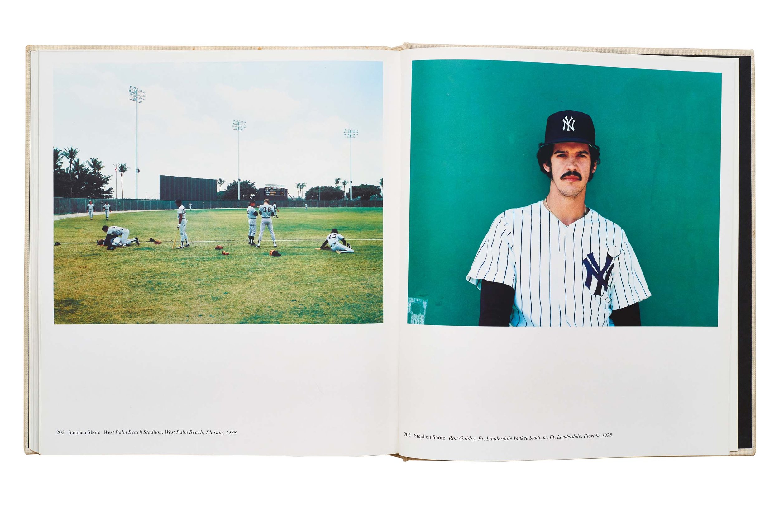
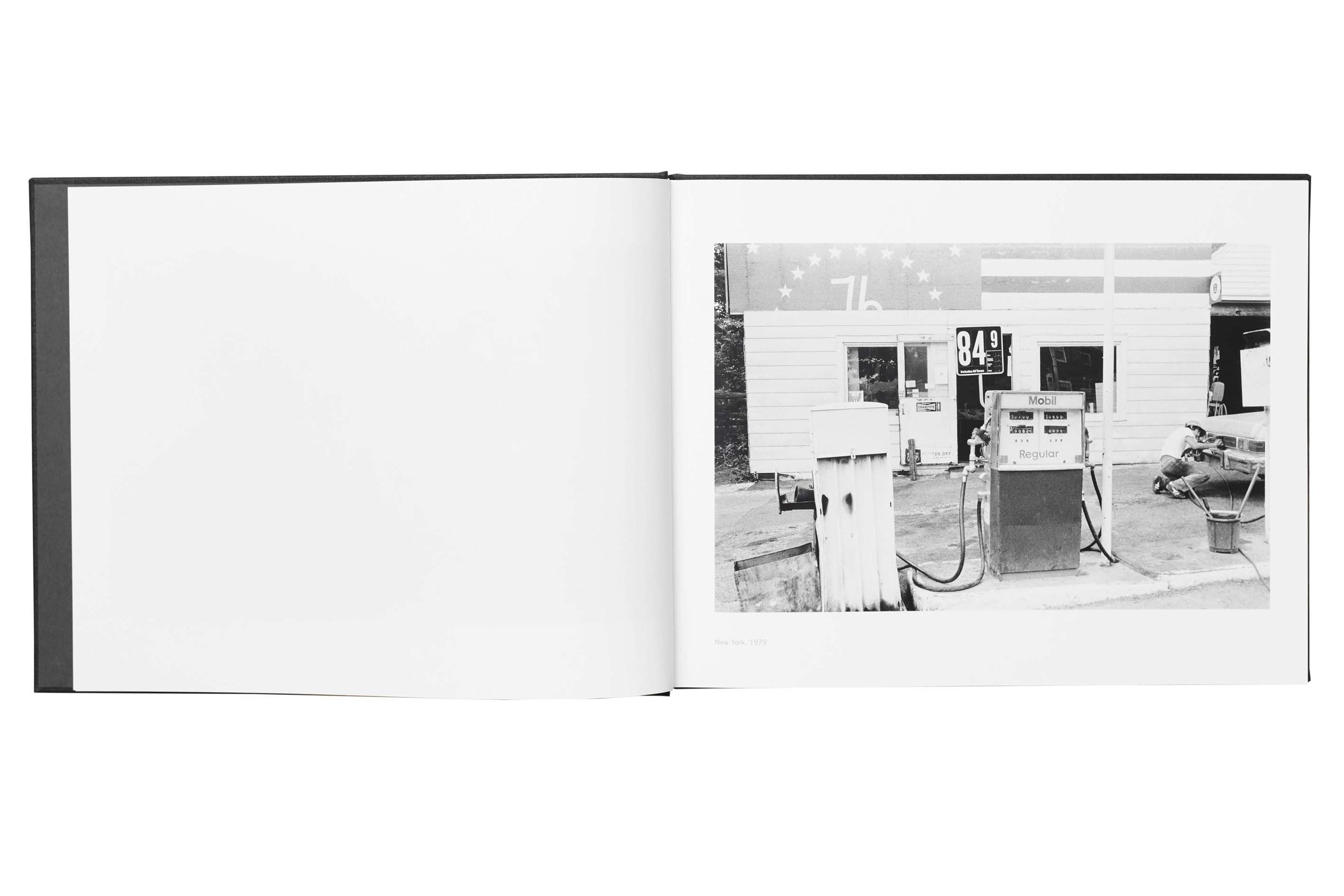
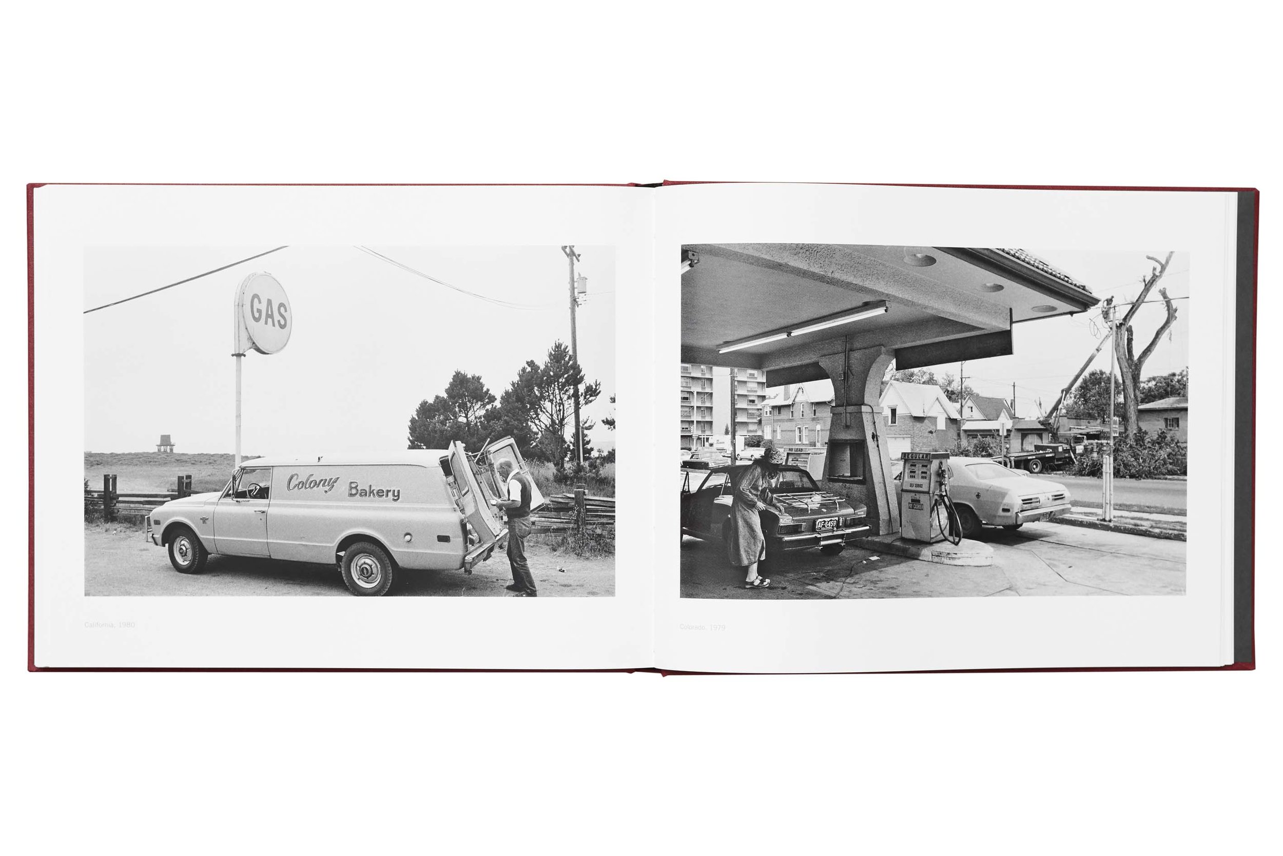
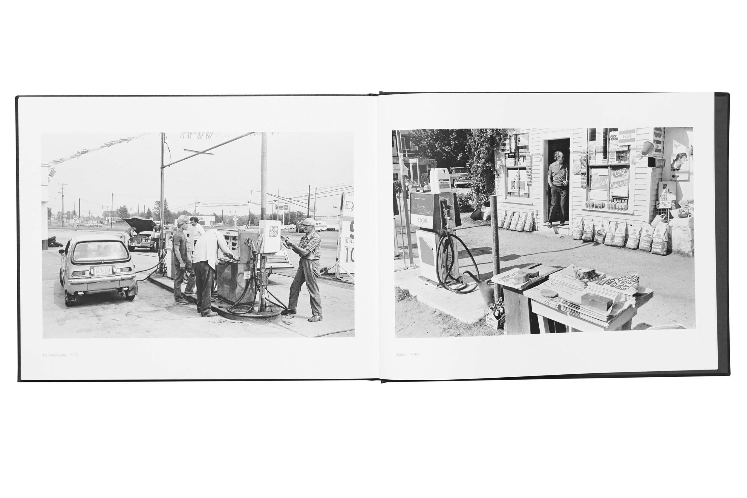
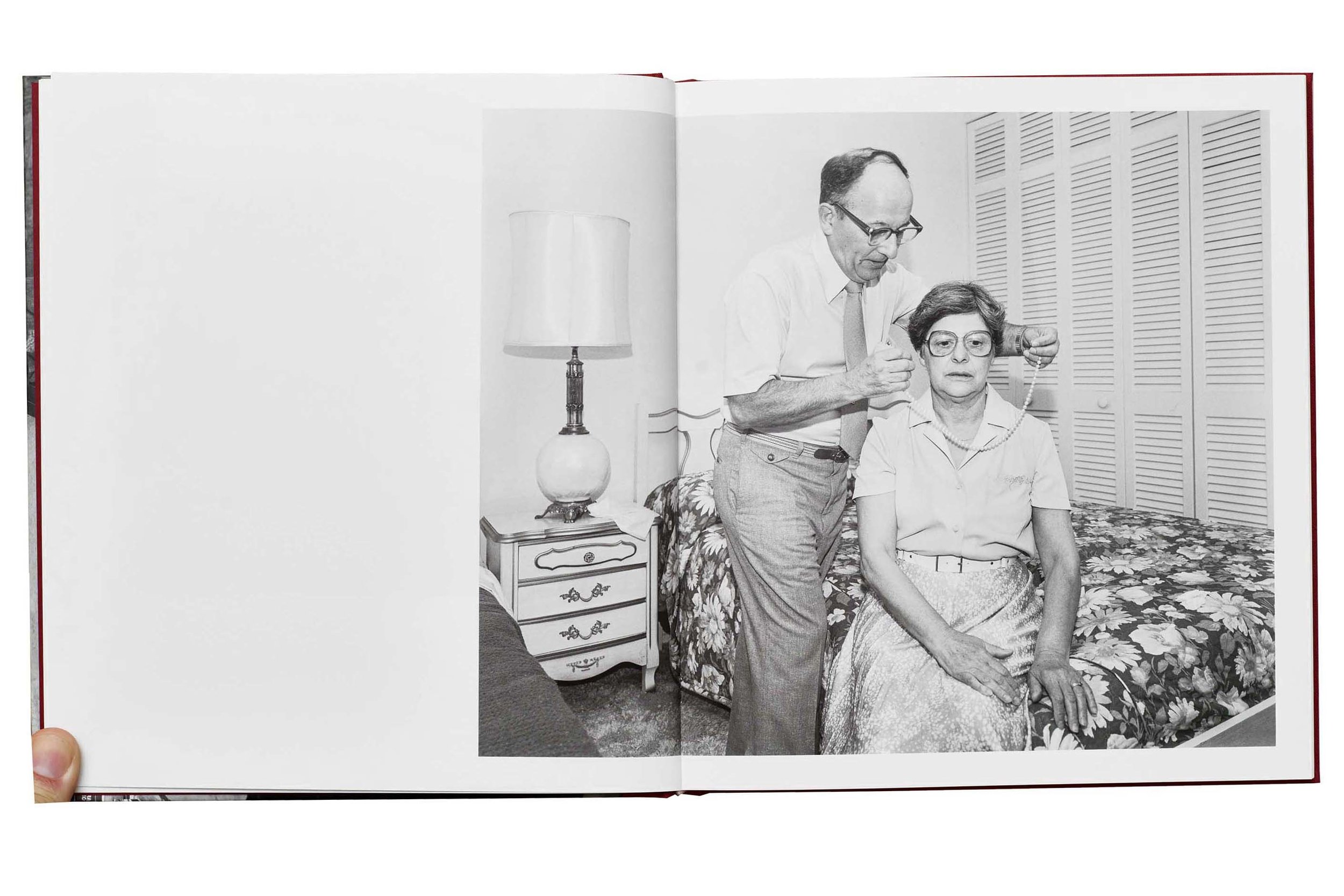
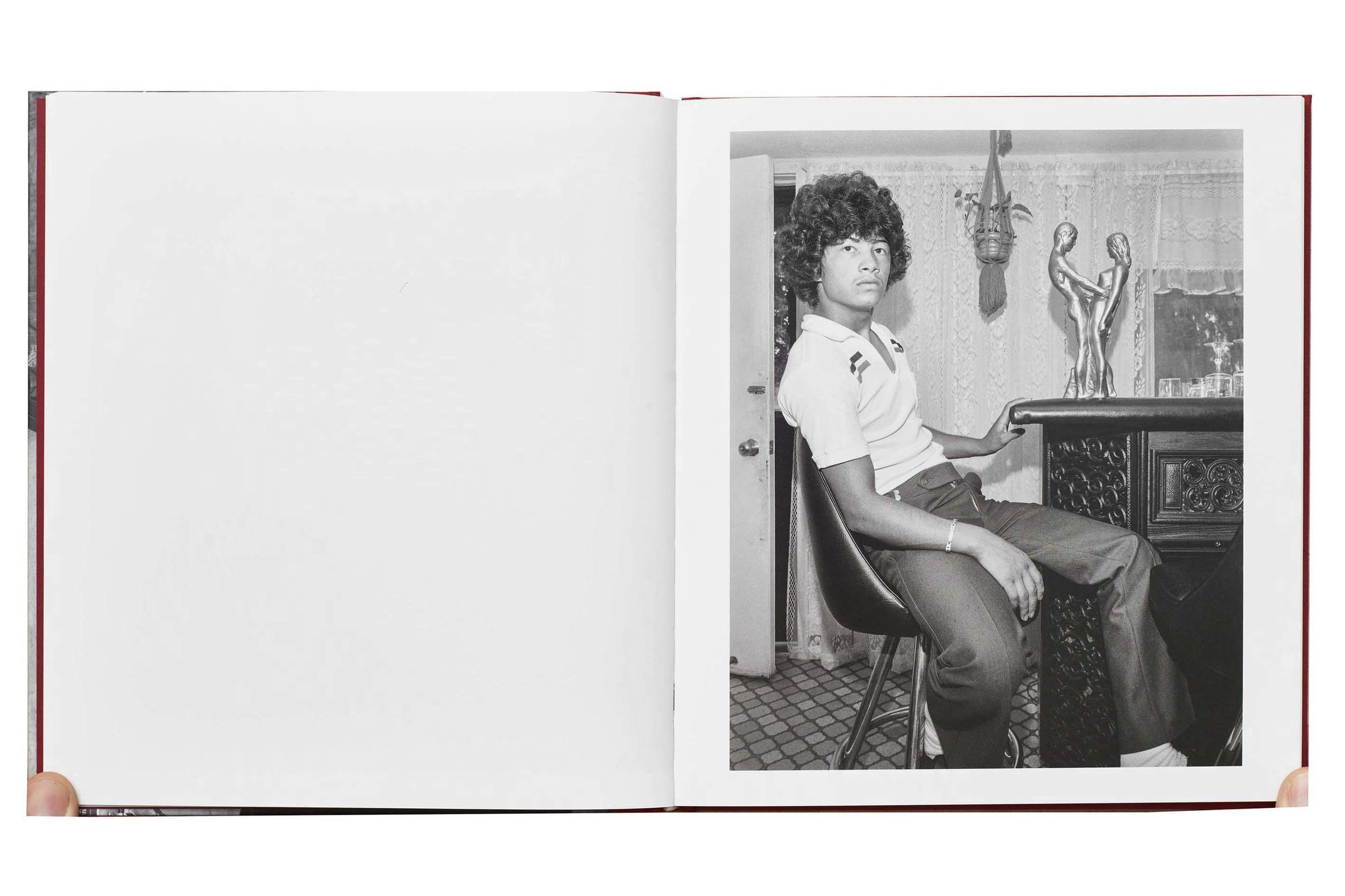
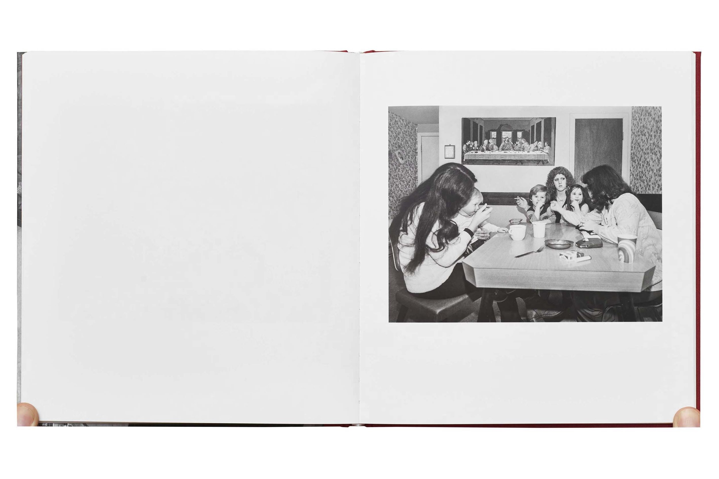
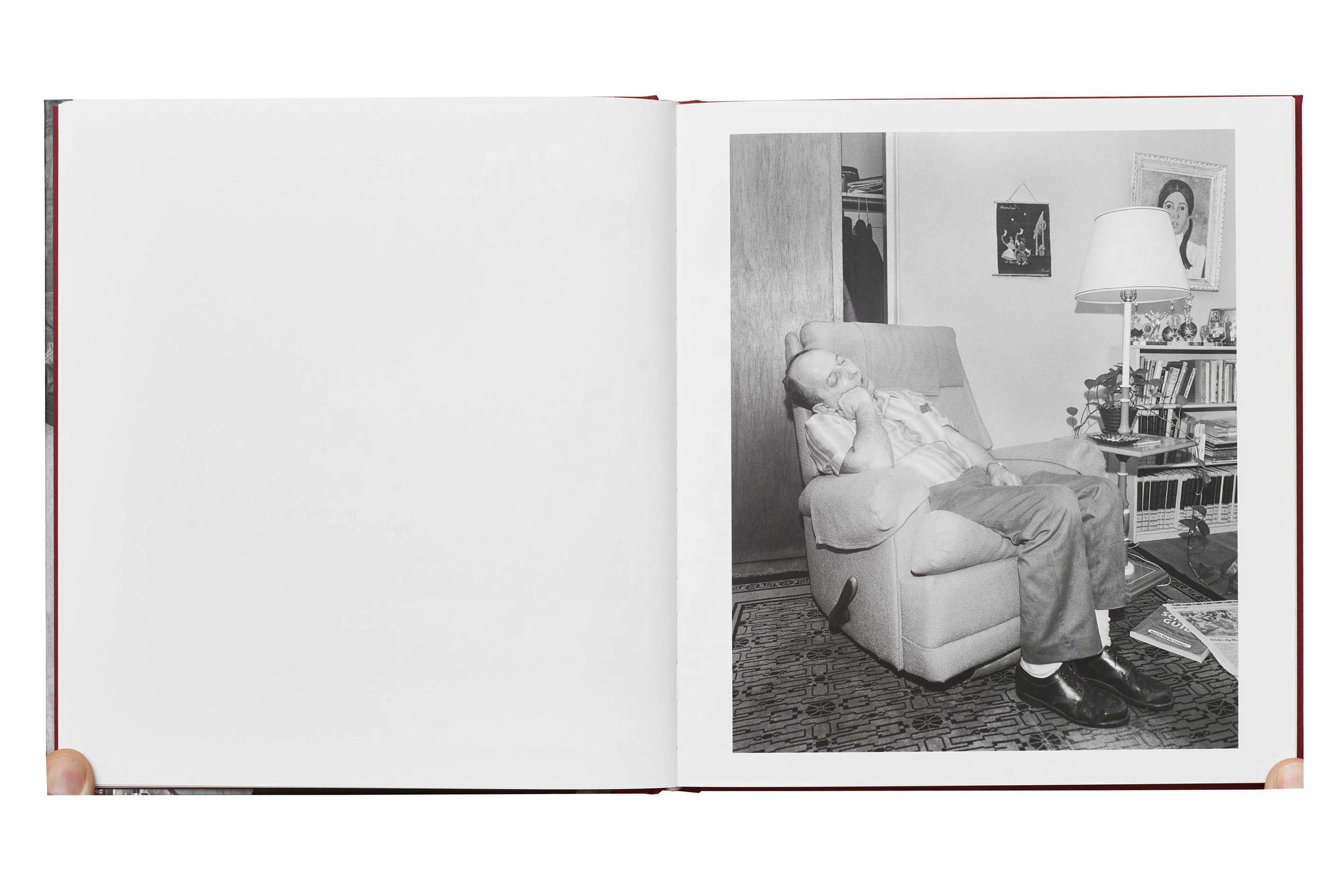
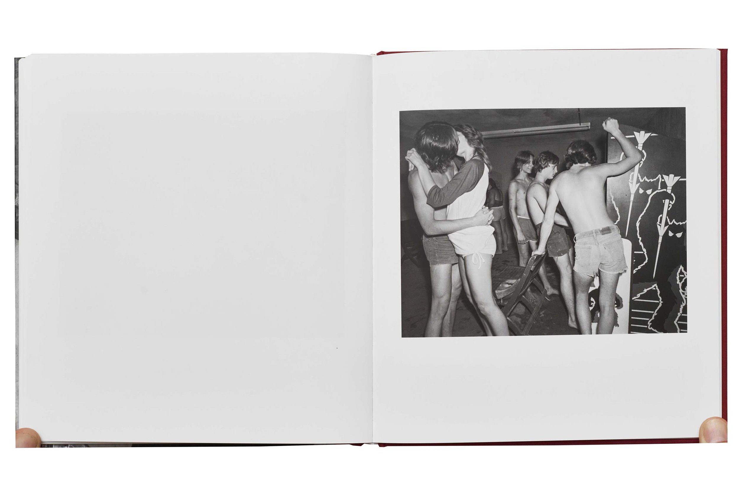
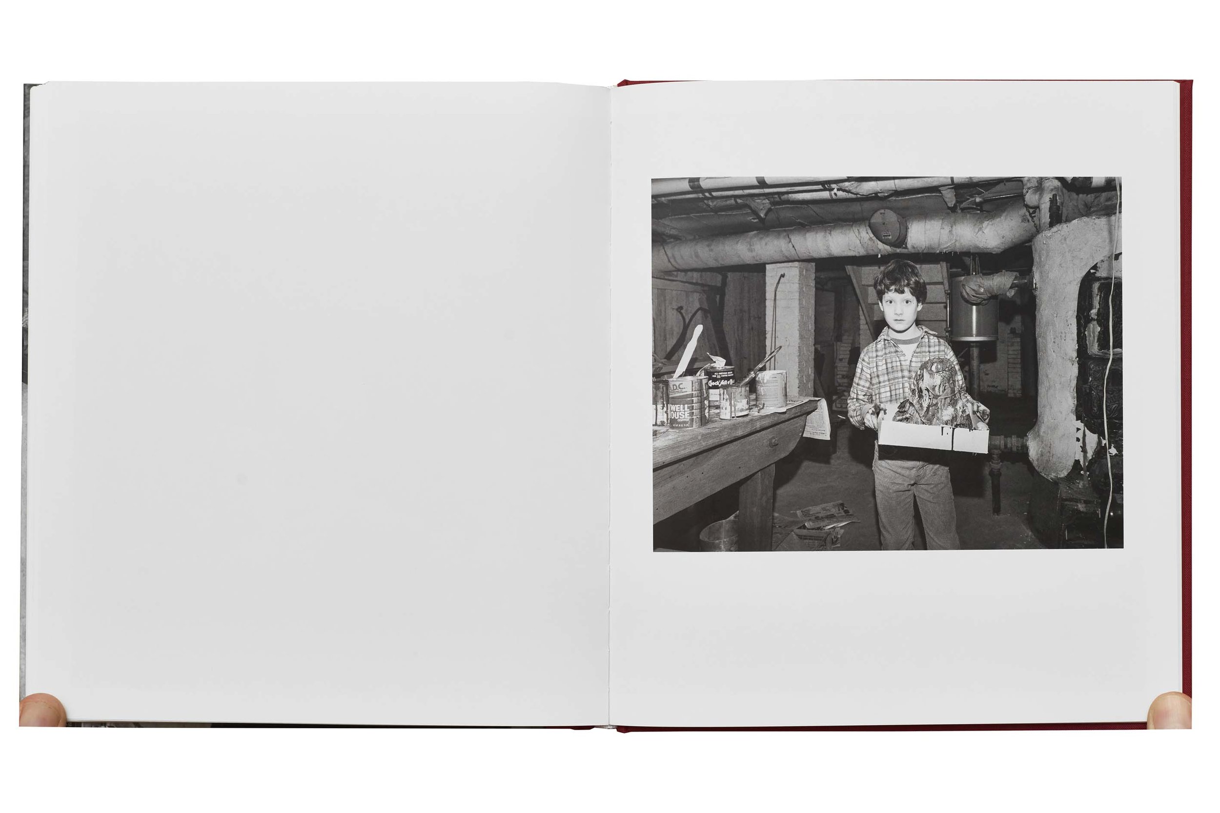
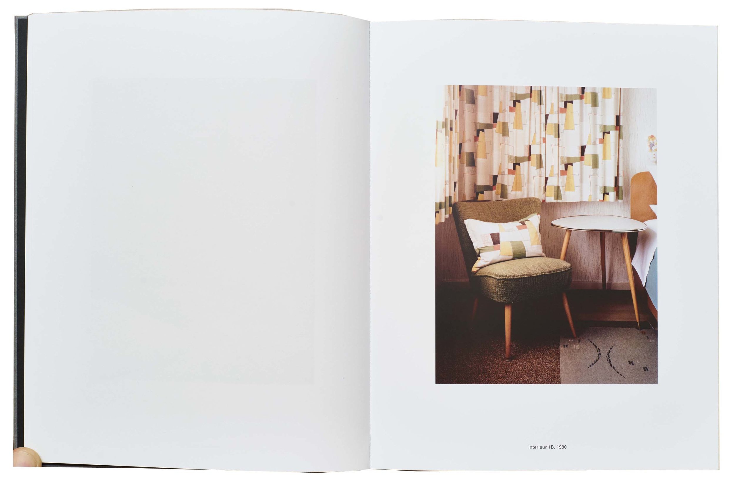
Published in 1979 American Images: New Work by Twenty Contemporary Photographers reproduces 160 photographs from a project initiated in 1977 by the Bell System telecommunications conglomerate to create a general survey of contemporary American photographers. The only stipulation of the commissioned artists was that the new work be created within the USA and that each produce three sets of their fifteen photograph ‘portfolio’ that would be donated to museums. The list of artists reads like a virtual who’s who of late-70s practice; Robert Adams, Lewis Baltz, Harry Callahan, William Clift, Linda Conner, Bevan Davies, Roy DeCarava, William Eggleston, Elliott Erwitt, Larry Fink, Frank Gohlke, John Gossage, Jonathan Green, Jan Groover, Mary Ellen Mark, Joel Meyerowitz, Richard Misrach, Nicholas Nixon, Tod Papageorge and Stephen Shore.
What is still impressive about this volume, aside from how good a majority of the work is for a commission from one year, is the cleanliness of design and the quality of printing especially the black and white plates. The printing was by Acme Printing Company of Boston who also inked Park City and Nevada for Lewis Baltz.
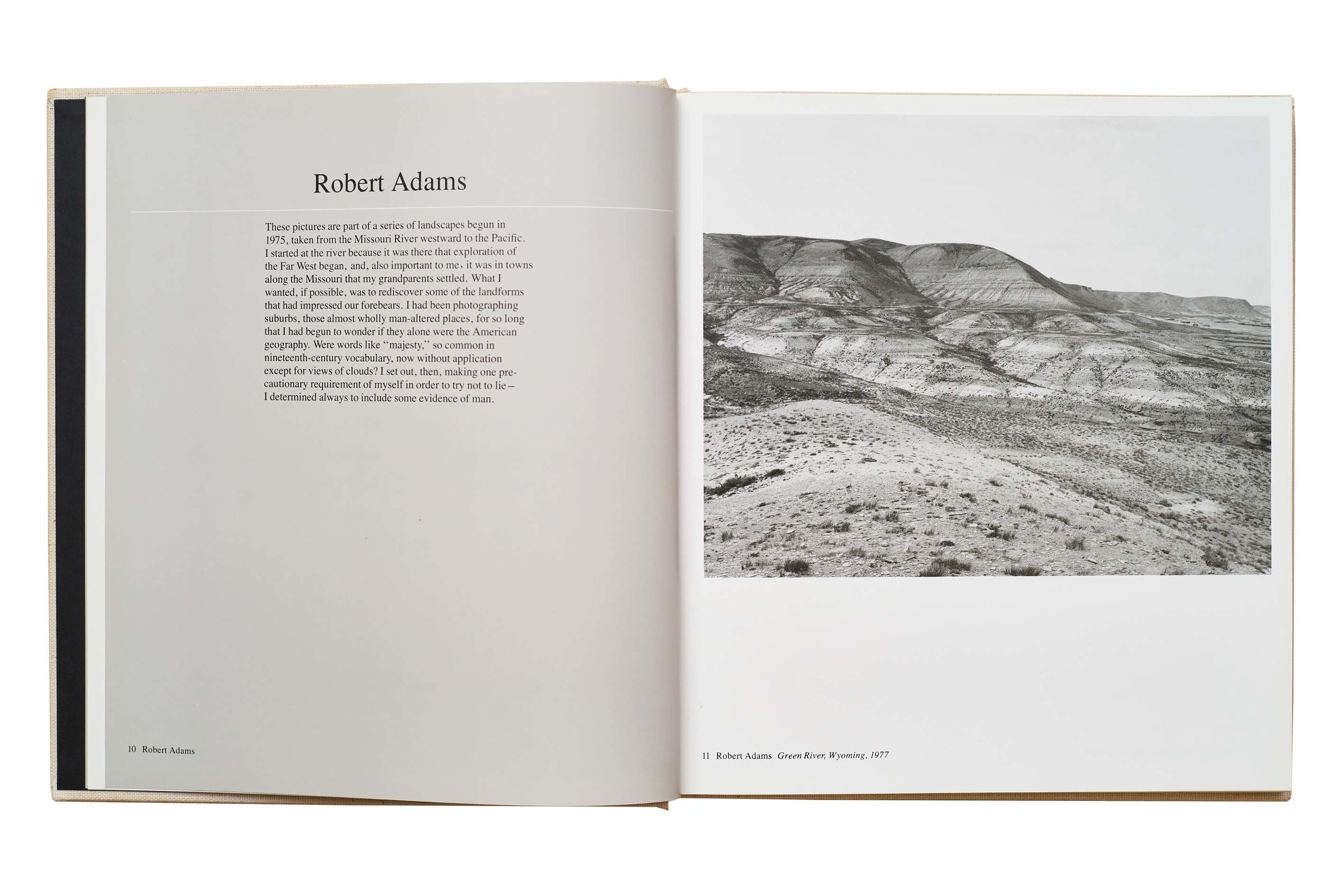
What is less impressive about this volume are the artist statements that precede each section of a photographer’s eight photographs. Obviously such statements are aimed at a more general audience, those that may attend the exhibition and want to know in advance what they are looking at from the photographer’s mouth, but with rare exception they mostly seem rather silly or tread into a word salad of pretention. Only two photographers, John Gossage and Lewis Baltz, chose what seemed to be the smarter route stating “The photographer prefers not to make a statement about his work.” For viewers for which the work might be truly important, we can figure it out. The less said the better. And considering hardcover copies of American Images can be had for less than ten dollars, the “pleasures of good photographs” are also a bargain.
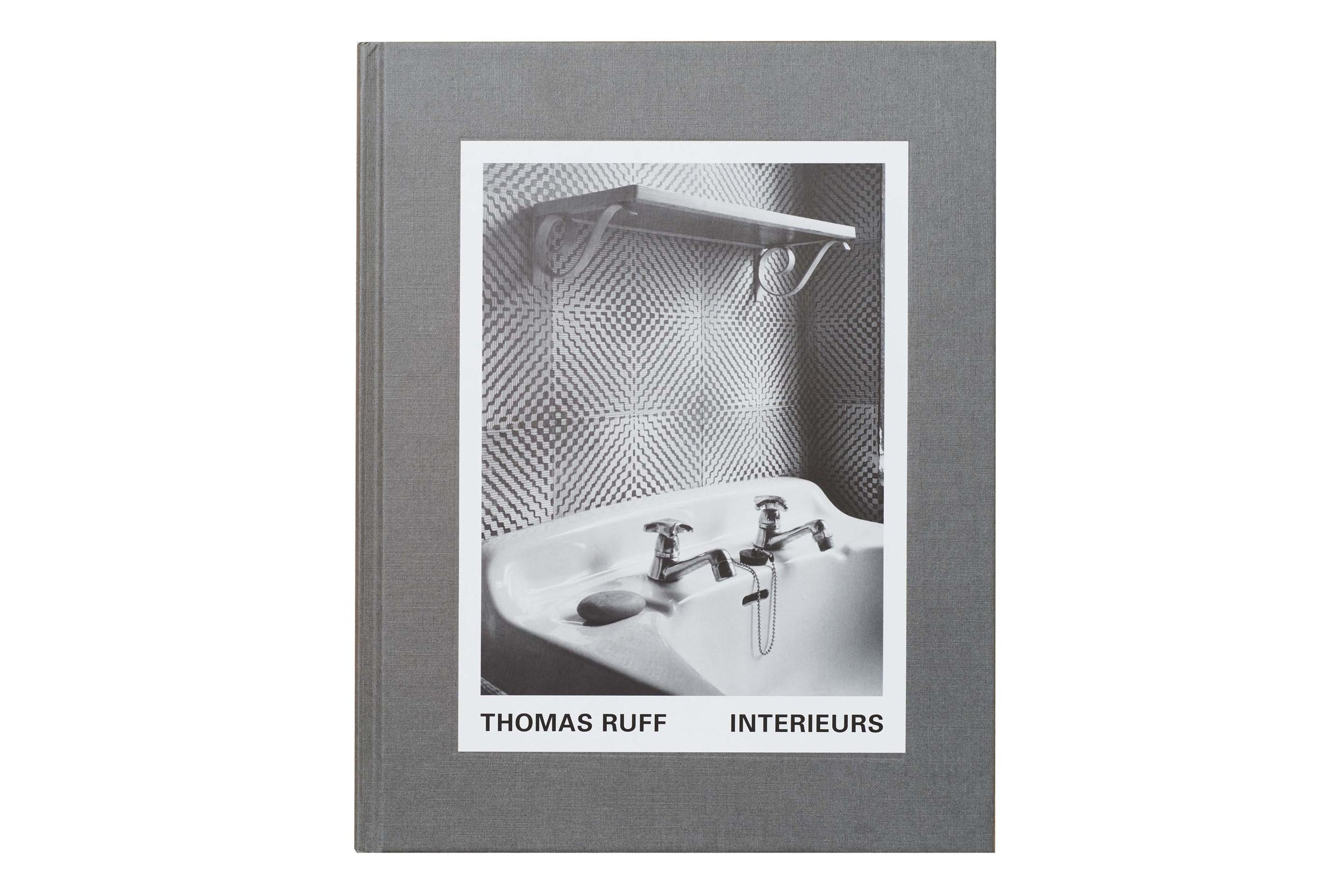
- American Images: New Work by Twenty Contemporary Photographers
- Edited by Renato Danese
- McGraw Hill, 1979
- ISBN: 9780070152953